Tableau Saves Me Time

View my Tableau Public page for all the charts i've created.


It's easier and faster to conduct exploratory analysis on Tableau versus R and the charts look prettier too.

For example, Instead of writing lines of code, copy-pasting, and editing this using R:
library("pacman")
pacman::p_load(ggplot2, grid, gridExtra, robustbase)
data = read.csv(file.choose())
str(data)
attach(data)
#Transform to factors
PsychRegions <- as.factor(PsychRegions)
region <- as.factor(region)
division <- as.factor(division)
# Using boxplots for each variable separately
# data.science
u01 <- qplot(data = data, y = data.science, x = 1,
geom = "boxplot", outlier.colour = "#E38942",
xlim = c(0, 2), xlab=NULL, ylab = NULL,
main="data.science") +
geom_text(aes(label = ifelse(data.science %in%
boxplot.stats(data.science)$out,
as.character(state_code), "")), hjust = 1.5)
u01
# cluster.analysis
u02 <- qplot(data = data,y = cluster.analysis, x = 1,
geom = "boxplot", outlier.colour = "#E38942",
xlim = c(0, 2), xlab = NULL, ylab = NULL,
main = "cluster.analysis") +
geom_text(aes(label = ifelse(cluster.analysis %in%
boxplot.stats(cluster.analysis)$out,
as.character(state_code), "")), hjust = 1.5)
u02
# college
u03 <- qplot(data = data, y = college, x = 1,
geom = "boxplot", outlier.colour = "#E38942",
xlim = c(0, 2), xlab = NULL, ylab = NULL,
main="college") +
geom_text(aes(label = ifelse(college %in%
boxplot.stats(college)$out,
as.character(state_code), "")), hjust = 1.5)
u03
# startup
u04 <- qplot(data = data, y = startup, x = 1,
geom = "boxplot", outlier.colour = "#E38942",
xlim = c(0, 2), xlab = NULL, ylab = NULL,
main="startup") +
geom_text(aes(label = ifelse(startup %in%
boxplot.stats(startup)$out,
as.character(state_code), "")), hjust = 1.5)
u04
# entrepreneur
u05 <- qplot(data = data, y = entrepreneur, x = 1,
geom = "boxplot", outlier.colour = "#E38942",
xlim = c(0, 2), xlab = NULL, ylab = NULL,
main="entrepreneur") +
geom_text(aes(label = ifelse(entrepreneur %in%
boxplot.stats(entrepreneur)$out,
as.character(state_code), "")), hjust = 1.5)
u05
# ceo
u06 <- qplot(data = data, y = ceo, x = 1,
geom = "boxplot", outlier.colour = "#E38942",
xlim = c(0, 2), xlab = NULL, ylab = NULL,
main="ceo") +
geom_text(aes(label = ifelse(ceo %in%
boxplot.stats(ceo)$out,
as.character(state_code), "")), hjust = 1.5)
u06
# mortgage
u07 <- qplot(data = data, y = mortgage, x = 1,
geom = "boxplot", outlier.colour = "#E38942",
xlim = c(0, 2), xlab = NULL, ylab = NULL,
main="mortgage") +
geom_text(aes(label = ifelse(mortgage %in%
boxplot.stats(mortgage)$out,
as.character(state_code), "")), hjust = 1.5)
u07
# nba
u08 <- qplot(data = data, y = nba, x = 1,
geom = "boxplot", outlier.colour = "#E38942",
xlim = c(0, 2), xlab = NULL, ylab = NULL,
main="nba") +
geom_text(aes(label = ifelse(nba %in%
boxplot.stats(nba)$out,
as.character(state_code), "")), hjust = 1.5)
u08
# royal.family
u09 <- qplot(data = data, y = royal.family, x = 1,
geom = "boxplot", outlier.colour = "#E38942",
xlim = c(0, 2), xlab = NULL, ylab = NULL,
main="royal.family") +
geom_text(aes(label = ifelse(royal.family %in%
boxplot.stats(royal.family)$out,
as.character(state_code), "")), hjust = 1.5)
u09
# Neuroticism
u10 <- qplot(data = data, y = Neuroticism, x = 1,
geom = "boxplot", outlier.colour = "#E38942",
xlim = c(0, 2), xlab = NULL, ylab = NULL,
main="Neuroticism") +
geom_text(aes(label = ifelse(Neuroticism %in%
boxplot.stats(Neuroticism)$out,
as.character(state_code), "")), hjust = 1.5)
u10
# Plot all 10 together
grid.arrange(u01, u02, u03, u04, u05,
u06, u07, u08, u09, u10,
nrow = 2,
top = "Boxplots: Univariate outliers")

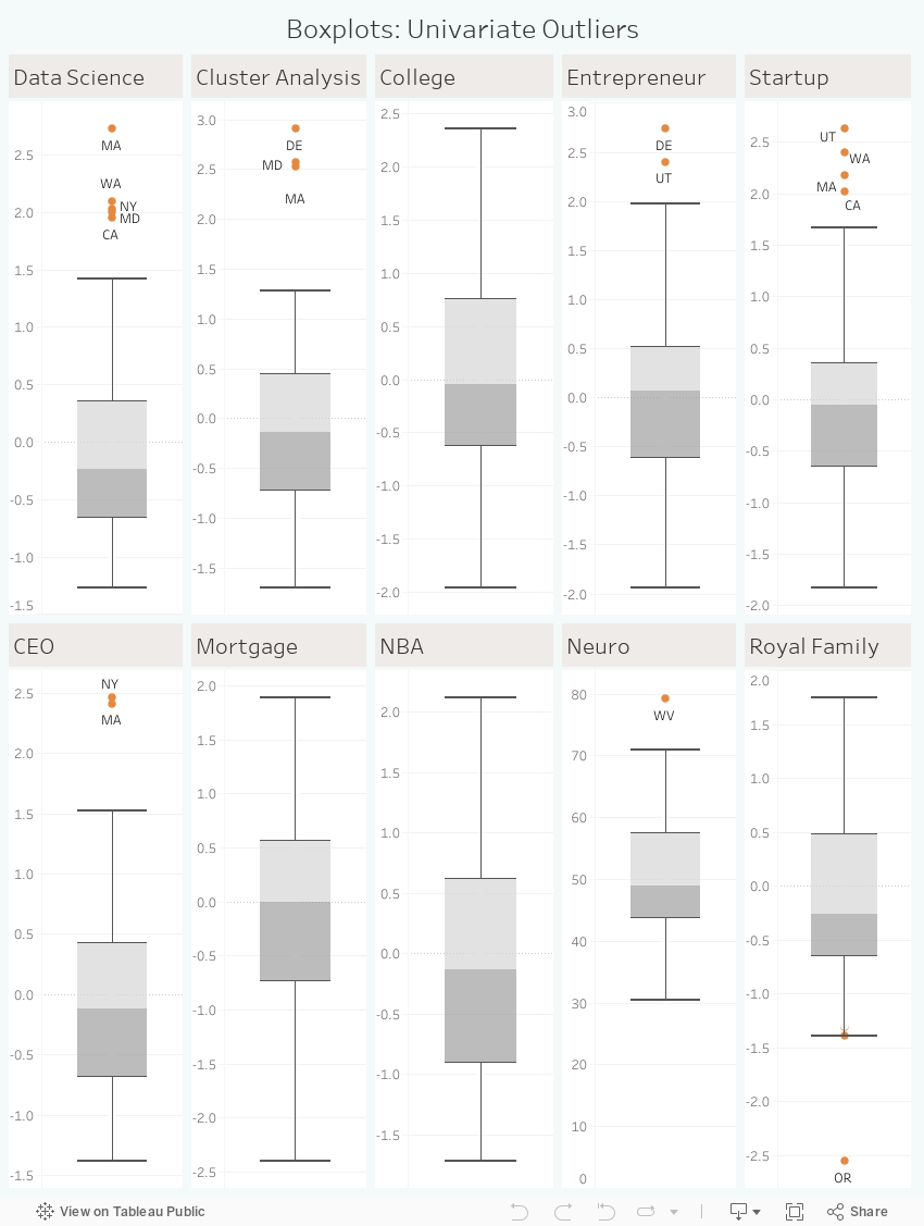
In order to ultimately get this:


I could just drag and drop pills, write 2 lines of Calculated Fields, and do some optional layouting on Tableau to do this:


Comments